Buccumi B.I. Design
Work: B.I. Design Guide
Date: 2021
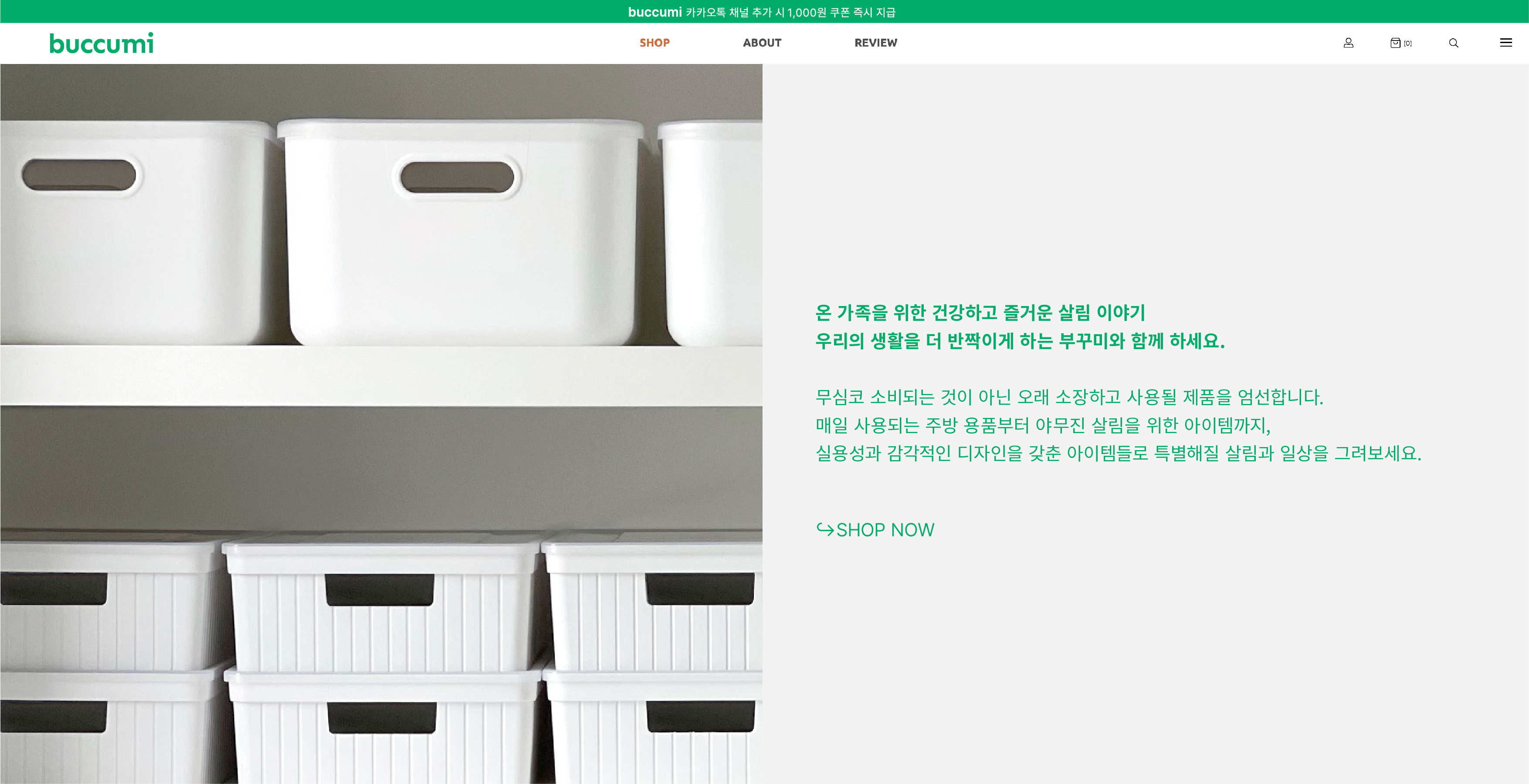
팔로워 20만명의 리빙 인플루언서 홈멍멍(@hommongmong)의 공동구매 플랫폼 브랜드<Buccumi>의 브랜드 아이덴티티 디자인.
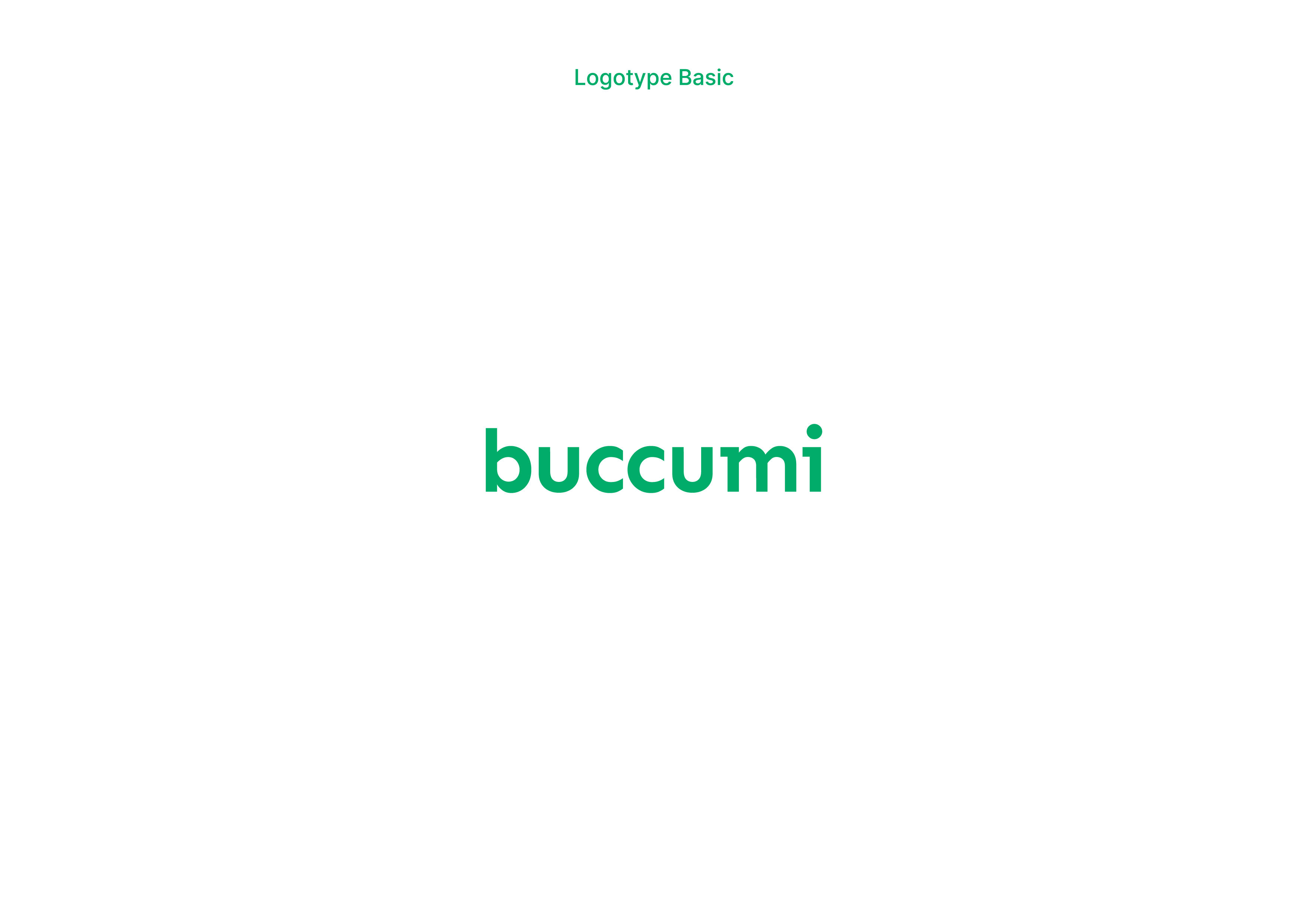
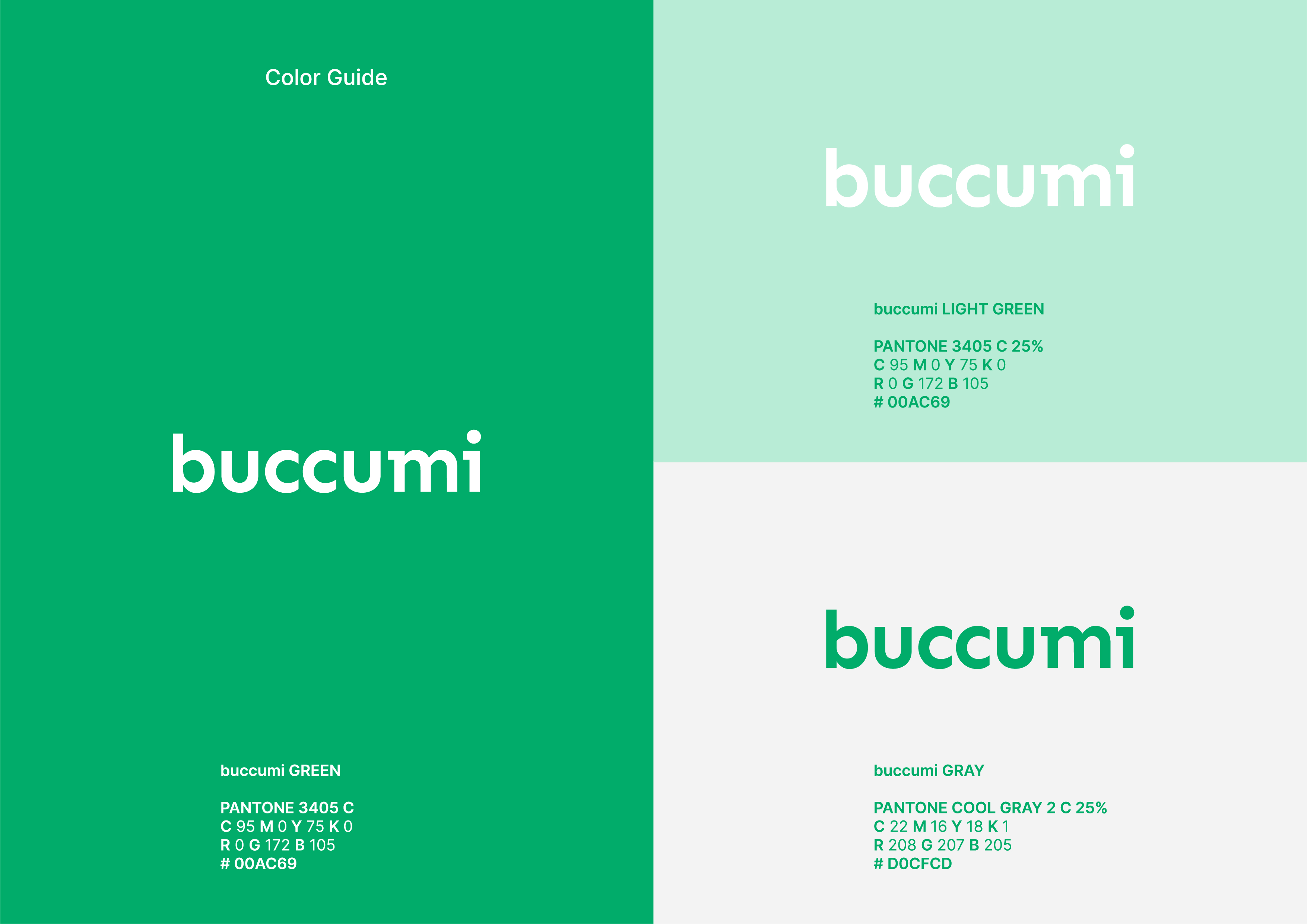
매일 사용되는 주방 용품부터 야무진 살림을 위한 아이템까지, 실용성과 감각적인 디자인을 갖춘 아이템들을 엄선하고 소개하는 플랫폼으로서 홈멍멍의 키캐릭터인 ‘깔끔한, 군더더기 없이 정리된, 똑부러진’ 살림 아이템들을 로고에서 느낄 수 있도록 하였습니다. 로고의 정렬된 엑스-하이트(X-height)와 m, i에서 슬랩 세리프를 적용하여 각을 맞춰 선반에 정리된 리빙용품들이 연상시킬 수 있도록 하였고, Green이나 Gray 등 중립적인 컬러를 사용하여 어느 공간에나 적용가능한 제품들을 소개하는 브랜드의 성격을 담아냈습니다.
Brand identity design for Buccumi, a group purchase platform of living influencer Hommongmong (approx. 200,000 SNS followers).
From kitchen items geared toward daily use to items aimed at tidying and organizing living spaces, this platform selects and introduces products with practical and sensible design, introducing consumers to "clean, streamlined, and thoughtful” household goods at the core of Hommongmong. The logo utilizes an aligned X-height and a slab serif on the brand name’s last syllable “mi,” which remind consumers of living items arranged on a shelf, while using neutral green and gray tones to suggest products that are suited to all types of domestic space.
Work: B.I. Design Guide
Date: 2021
팔로워 20만명의 리빙 인플루언서 홈멍멍(@hommongmong)의 공동구매 플랫폼 브랜드<Buccumi>의 브랜드 아이덴티티 디자인.
매일 사용되는 주방 용품부터 야무진 살림을 위한 아이템까지, 실용성과 감각적인 디자인을 갖춘 아이템들을 엄선하고 소개하는 플랫폼으로서 홈멍멍의 키캐릭터인 ‘깔끔한, 군더더기 없이 정리된, 똑부러진’ 살림 아이템들을 로고에서 느낄 수 있도록 하였습니다. 로고의 정렬된 엑스-하이트(X-height)와 m, i에서 슬랩 세리프를 적용하여 각을 맞춰 선반에 정리된 리빙용품들이 연상시킬 수 있도록 하였고, Green이나 Gray 등 중립적인 컬러를 사용하여 어느 공간에나 적용가능한 제품들을 소개하는 브랜드의 성격을 담아냈습니다.
Brand identity design for Buccumi, a group purchase platform of living influencer Hommongmong (approx. 200,000 SNS followers).
From kitchen items geared toward daily use to items aimed at tidying and organizing living spaces, this platform selects and introduces products with practical and sensible design, introducing consumers to "clean, streamlined, and thoughtful” household goods at the core of Hommongmong. The logo utilizes an aligned X-height and a slab serif on the brand name’s last syllable “mi,” which remind consumers of living items arranged on a shelf, while using neutral green and gray tones to suggest products that are suited to all types of domestic space.